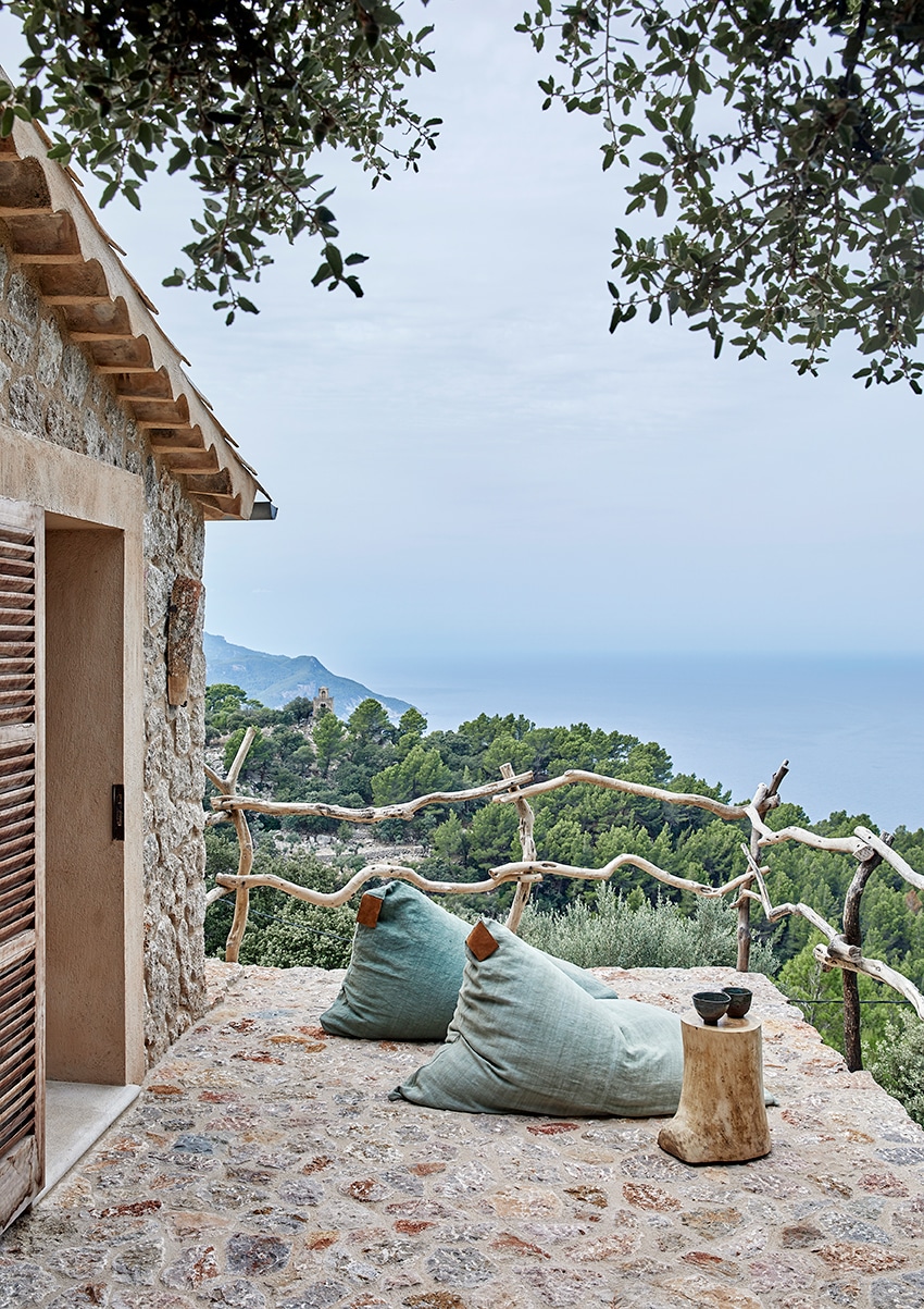
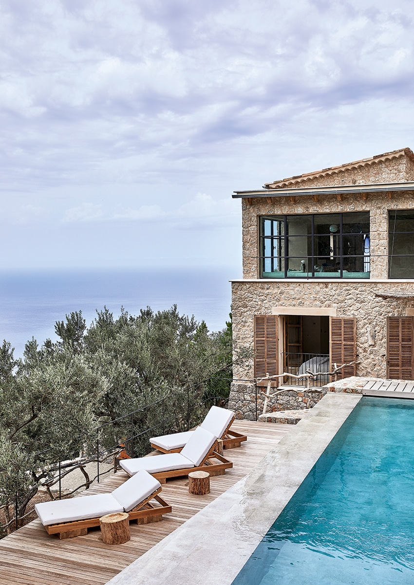
It’s very easy to fall in love with Mallorca – but these days it’s not nearly as effort-free to find just the right holiday property on this beautiful Balearic island. The London-based international couple that own this house spent several months diligently searching for just the right place for them until they eventually chanced upon this one. Situated on a hillside with 180-degree views of the Mediterranean Sea, the house is situated on the western side of Mallorca, between the lively villages of Valldemossa and Deià.
Protected on the southern side by the enfolding Tramuntana mountain range and set within groves of olive trees, the property feels utterly private and tucked away. But the villages are close by (Valldemossa is a five-minute drive from the house) as are some of the island’s prettiest calas (coves) – and the owners’ favourite beach is Port des Canonge, with its charm and seclusion well worth the 30 minutes it takes to reach by road.
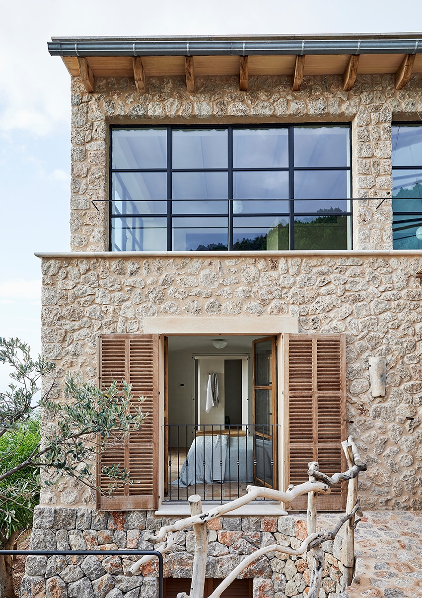
When the owners purchased the property, the house was a fairly ordinary piece of construction from the 1960s-1970s, and since then, building regulations have changed substantially on the island. The owners asked Deià-based design and architecture practice More Design – which specialises in creating historically sensitive renovations that blend Mallorquin tradition with contemporary elements – to work on the house. More Design’s Manuel Villanueva explains that the structure ‘had no stone on the outside, and we had to legalise parts of it’, so these became the first issues to be tackled.
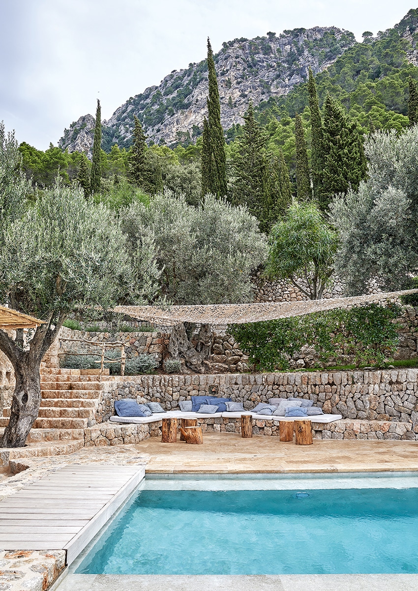
The pool area includes a shaded built-in lounging area. The mattresses were custom made by a local upholsterer and the blue cushions were made from rugs dyed in various shades of blue, both to More Decor’s specifications. The wood side tables were also designed by More Decor and made by a local carpenter.
Once that process was begun, More Design created a comprehensive plan for the property and as a result, the homeowners and the firm ‘developed and grew together into the design, and it became a very ambitious renovation,’ says Villanueva. ‘We had to basically rebuild the entire house from the foundations upwards, while maintaining the existing footprint.’
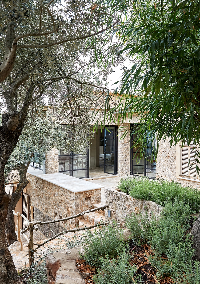
From the driveway, the stone-clad exterior of the house and the glass doors leading into two parts of its main open-plan living space can be spotted through the terraced landscape that surrounds it (the landscape design is also by More Design). Designer Manuel Villanueva says that one of the overall aims of the renovation project was to ‘reconnect the house with the landscape around [it]’.
To create a feeling of spaciousness and ease, multiple small rooms were opened up to make a large open-plan living space that forms the centre of the house and functions as ‘the main gathering space’ as Villanueva puts it. The kitchen, living room, enclosed porch and dining area are all part of this central heart of the home. The result is that within a ‘traditional envelope’ as Villanueva puts it, an expansive and contemporary feeling of space has been created. ‘For us,’ he says, ‘it is a very special project as it allowed us to evolve from more traditional concepts to explore contemporary schemes and ideas.’
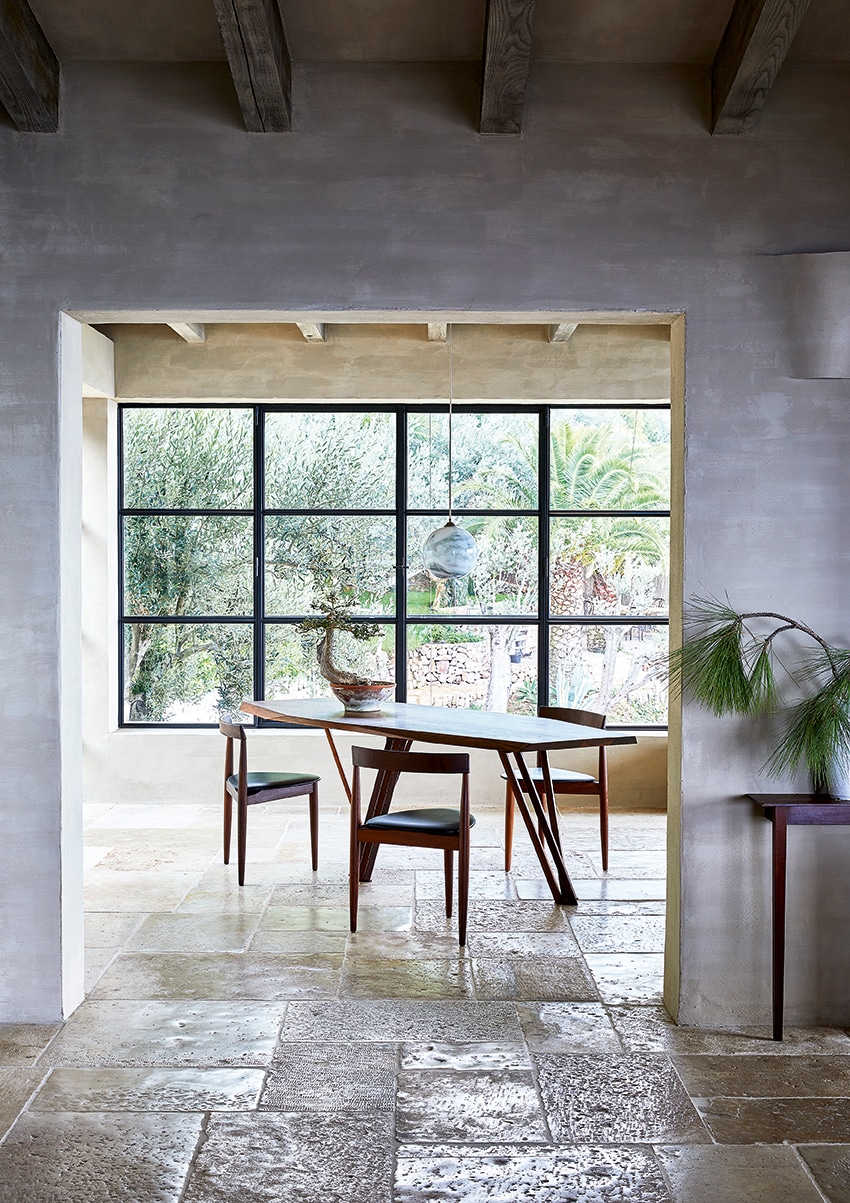
and bespoke marbled glass ceiling pendants made to order by a specialist UK glassblowing company. The wooden table and chairs were sourced from a vintage furniture dealer (the chairs are vintage Hans Olsen designs, originally created for Danish furniture company Frem Røjle; similar versions can be sourced from such as Pamono). The bonsai is a 60-year-old wild native olive tree, which designer Tille de Negro found in a gypsy market on the island.
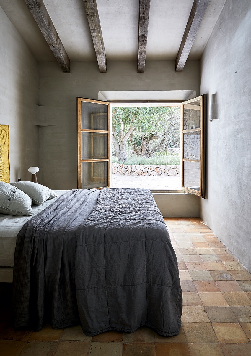
Another key element of the finished project is the home’s interior design. More Decor, which is managed by Tille Del Negro, is the brand new interior-design arm of the More Design practice, and was responsible for creating the interiors. These began with a collaboration between More Decor and Belgian artisan painter and designer Eddy Dankers (who is becoming well-known for his mineral-based paints and traditional paint techniques) to create unique wall and ceiling finishes for the house.
Del Negro says of the collaboration with Dankers, ‘We have wanted to explore the world of lime washes and pigments to add another dimension to our projects.
Our aim was to distil the neutral shades of the surrounding landscape and reflect and incorporate [these] for the interiors.’ She goes on to explain that the lime-wash colours are perfectly matched to each individual room of the house to ensure that ‘where a space holds the most luminosity, the lime is lighter, [while] the colour grows more intense and darker in areas that are more shady.’
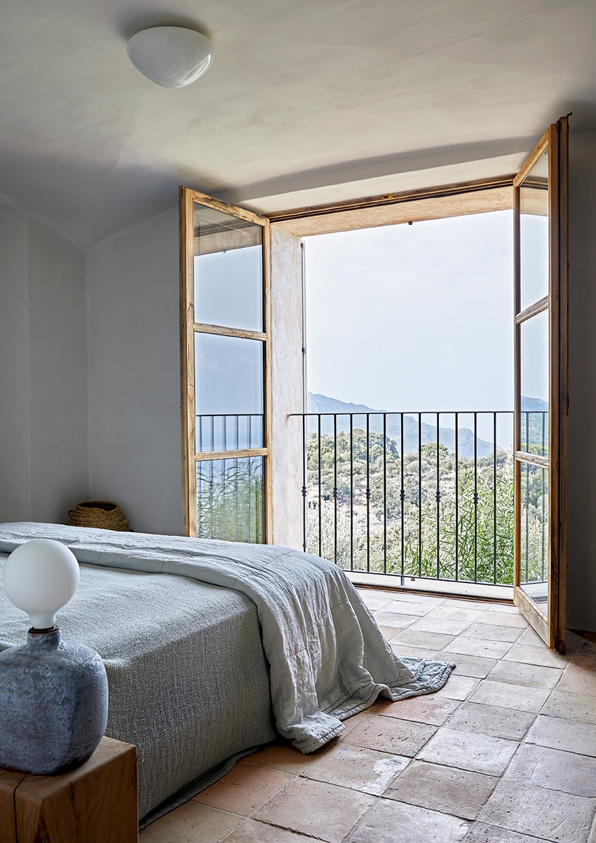
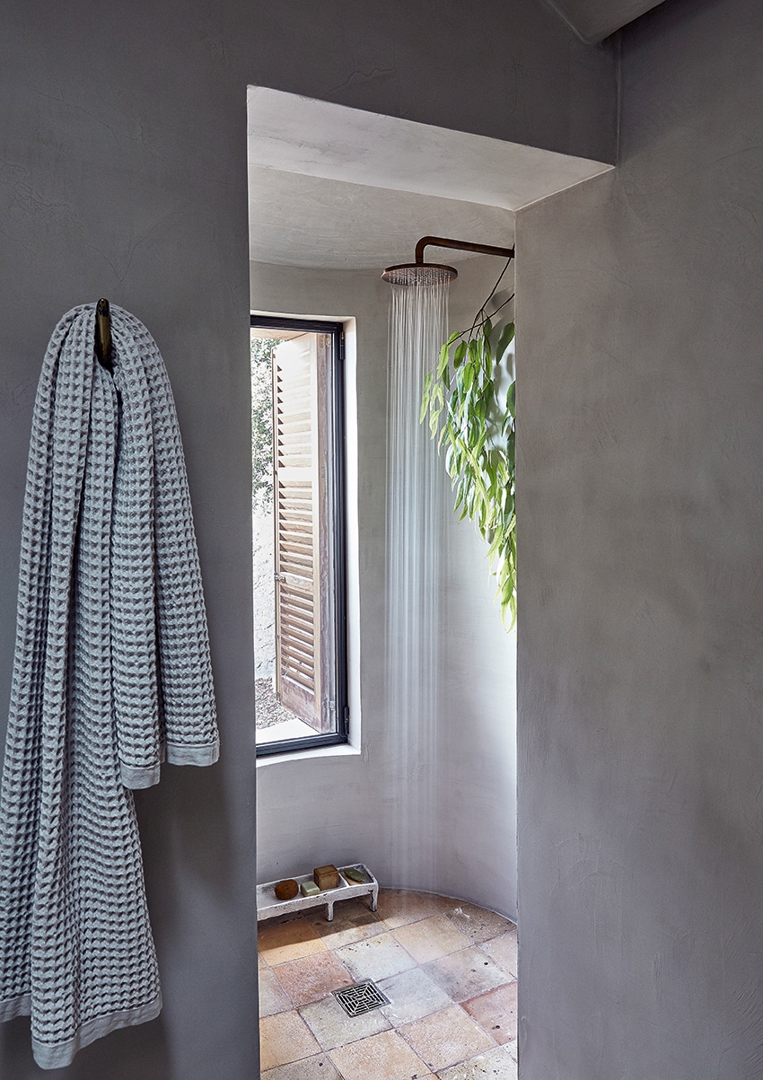
More Decor also designed or sourced all the additional elements of the interiors, including soft furnishings, lamps and even artworks. The final result is a house that is full of subtle yet strong colour, as well as an array of natural textures. This layered take on colour, in Del Negro’s words, ‘intensifies the personality of each space and sets a distinct mood and character’ throughout the home.
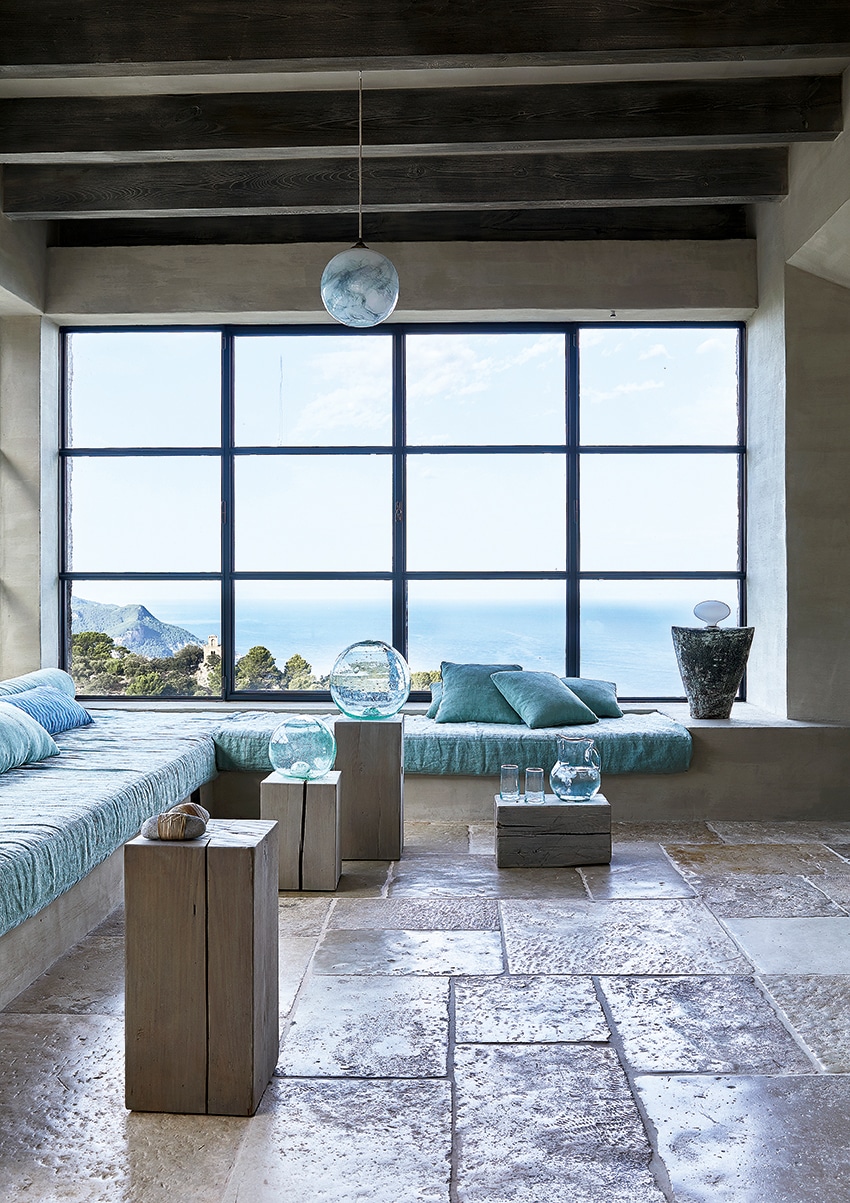
While the house is far from small – in addition to the living spaces, it contains six bedrooms en suite – it never feels overwhelmingly large or barn-like. This is both a result of its intimate interior design and due to the fact that it has been carefully reconnected with the surrounding landscape via ‘multiple access points and stairs’, says Villanueva. These in turn ‘activated the different levels and terraces that were [previously] isolated. This allows summer life to deploy in a rich landscape, where people can gather but also retreat to quiet corners.’ The ideal holiday house, in other words.
